Steel Rebrand Brings National Recognition for Ruddocks
Lincoln-based design and print agency Ruddocks has been named among the big hitters in the international design community for its rebrand of British Steel.
On Friday 16th December industry publication Design Week reviewed the logos that have defined 2016. Among the brands which received a mention was British Steel, which marked its return with a full rebrand in the summer.
Following confirmation of the sale and purchase agreement with Tata Steel in April, Greybull Capital decided to resurrected the iconic British Steel name which disappeared when the organisation merged with Koninklijke Hoogovens to form Corus Group in 1999.
When the new brand was officially launched on 1st June at the steel manufacturer’s Scunthorpe site it seemed that everyone had an opinion on the new logo, which had notably moved away from the previous design by David Gentleman.
Ruddocks’ Brand Director Andy Clayton said: “Greybull Capital’s brief was to create a brand identity that represented a vibrant new British Steel, renowned for producing world-class steel and providing first-class customer service.
“The old British Steel logo was iconic but we understood that they had to move in a different direction, so it was an exciting challenge for the team to come up with a new brand that echoes the brand values of pride, passion and performance.
“The design team worked closely with British Steel employees to create a new identity that they could feel proud of and empowered by, so hearing their positive feedback during the launch was a really proud moment for us.”
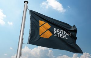
The logo is a combination of the B and S and is made up of three parts to represent the company’s core values of pride, passion and performance. The colours are derived from the elements of the steel-making process: molten orange signifies the start of something vibrant and exciting and the cool navy background colour is intended to represent the quality of the organisation – professional and committed.
Ruddocks’ Creative Director Ian Cant added: “Seeing our work for British Steel included in Design Week’s list of logos that defined the year, among the likes of Mastercard, NatWest and Nandos, really has been the icing on the cake for us this year.”
For more information about Ruddocks please visit the website: www.ruddocksdesign.co.uk
Ends
Notes to Editors
- Ruddock’s is a full-service design and print agency based in Lincoln.
- The agency has worked for local clients including Lincoln Cathedral and the University of Lincoln as well as national names such as Macdonald’s Hotels and Resorts, England Golf and NHS England.
- As well as an experienced and talented team of designers, Ruddocks has an in-house print and production facility, including litho, digital and large format equipment.
- For more information about Ruddocks please visit ruddocksdesign.co.uk
For further information about this news release please contact:
Kerri Saxby
Shooting Star
01522 528540
kerri@weareshootingstar.co.uk